Intercom Help Center Redesign
OVERVIEW
As part of a broader company strategy change, our group was assigned the task of enhancing the Help Center product. The problem was that our Help Center product offering hadn't been updated in six years. It had significant gaps in functionality and an outdated user interface compared to market leaders. Consequently, the Help Center lacked product-market fit and contributed to Intercom losing business to its competitors."
Timeframe
Jan 2023 - Ongoing
TEAM
3 teams, shifting down to 1.
Each team has 1 Designer, 1 PM, 1 EMs, 5-6 Engineers

Goals
COMPANY GOALs
The company's new goal is to become the number one customer support platform. While, for many features, this means we need the best product on the market, for the Help Center and Articles, it specifically means achieving Product-Market Fit (PMF).
PROJECT GOALS
Achieve Product Market Fit (PMF) with the Help Center product.
Remove the Help Center as a blocker for Sales.
Create a Help Center product that was equal to leading competitors.
Allow customers to create a seamlessly branded Help Center
TARGET USERS
The product works for businesses of any size however the business strategically choose to focus on:
Very small businesses (1-10 employees)
Small businesses (10 - 100)
Lower mid-market businesses (100 - 500)
These cohorts offered the greatest opportunity for the business.
CONSTRAINTS
9 months to get it all done.
Measuring Success
Before diving into feature design and development, it's crucial to define what success means. At Intercom, we typically measured performance and success using three key metrics. Let's use the Articles feature as an example. We evaluated success based on the following criteria:
Adoption: This refers to using a feature for the first time, such as creating and publishing a single article.
Activation: This involves using a feature a certain number of times, like creating five or more articles.
Deep Usage: This signifies long-term use of a feature, such as creating 50+ articles and engaging with them at least once in the last 30 days.
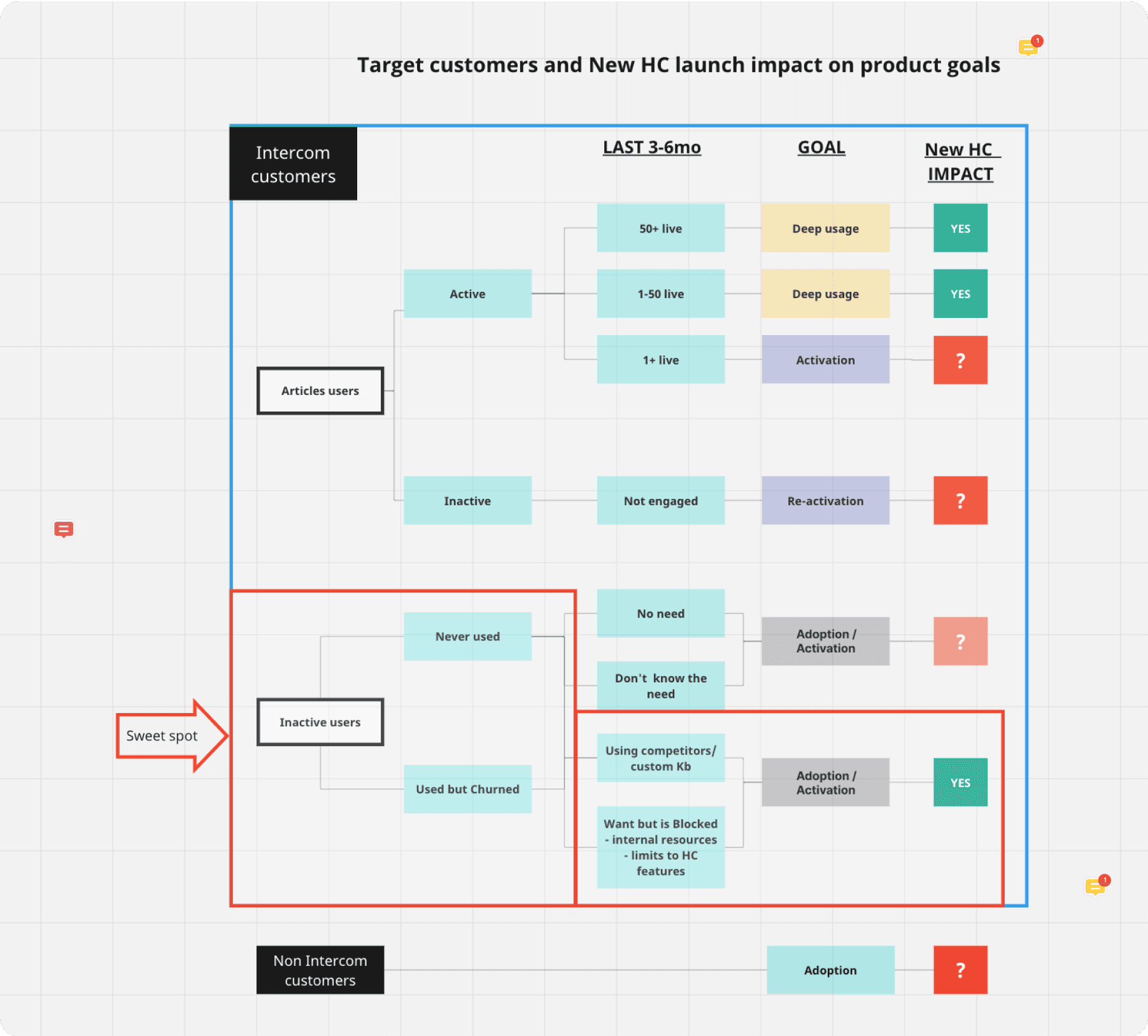
The goal and target user can vary for each metric. We intentionally focused on activation for inactive Help Center users for the following reasons:
Activation Over Adoption: We identified from quantitative data that the retention rate is much higher for customers who create 5+ articles.
52% of customers in the target segment who were actively using Intercom were not using our Help Center.
Our company's overarching goal is to become the number 1 customer support platform. A reliable indicator of progress is the increasing number of new customers using the product.
Additionally, addressing this issue helped unblock sales deals. Deals were falling through because our Help Center product was missing critical features.
We used three measurements to help determine success.
Increased Activation rate
This was the primary quantitative metric for assessing performance and success.
Converted Panel customers:
Qualitative measure. 13 customers who are blocked by our feature limitations. Goal is to switch 75% by end of Q3.
Leading Competitor scorecard
A feature rating comparison with the market leading competitor. This was an comparison of features and feature gaps. The goal was to close all critical feature gaps and be roughly equal across all features.

Research
PAST CUSTOMER FEEDBACK
All insights from previous customer interviews and research related to articles and the help center were gathered and analysed for most requested features.
QUANTITATIVE FEATURE ANALYSIS
I evaluated 38 Help Centers to understand what great experiences look like and determine the most commonly used components and design details. Some examples include multi column layout, colour customisation options, fonts, card styles and templates.
CUSTOMER INTERVIEW PANAL
We hand picked and interviewed 15 participants from the survey. This gave us great insights into context of use, pain points and frustrations, and most desired feature gaps. These customers were also added to a panel slack channel where we shared updated designs and requested feedback throughout the project.
DETAILED COMPETITOR REVIEW
The PM and I critically reviewed 2 direct competitors and 4 leading product outside our industry to understand the use cases, structure, look and feel, IA, layout, browse, search, and differentiators.
QUANT SURVEY
To be sure we were addressing the right PMF blockers we ran a survey with inactive target customers. The survey uncovered the most important blockers and feature requests.
PROBLEMS
The PM, EM and I worked closely together to analyse the research. The 3 biggest problems identified were:
Pricing
Awareness
Visual Customisation
Pricing
Pricing was the number one blocker from the Survey. We were confident this problem would be solved by the new Pricing plans due for release in Q3 where the Help Center and Articles would be essentially free on all plans.
Awareness
The second biggest problem customers had was lack of awareness. Customers didn’t know about the Help Center product offering, including how it connects to the rest of Intercom and what features were available.
I worked closely with the marketing team to highlight the Help Center core value proposition. I also created marketing assets and assisted with rebranding of the Help Center on the Intercom website and email marketing campaigns.
Visual Customisation
There were two main problems with visual customisation.
1. Customers wanted the product to have all the core features of their current provider.
2. The Help Center looked like Intercoms Help Center. They wanted it to look and feel like their brand.
We identified 4 main pillars to reach PMF.
Visual Design
Anything that visually allows the Help Center UI to be indistinguishable from the company website/brand such as color, text, size, images, icons, logo.
Layout and structure
Features to adapt the layout, content and structure. E.g. the ability to select a template for the homepage or add, edit, move and remove sections, content blocks, links.
Information Architecture
From navigation, number of pages, information hierarchy, table of content, search, labels etc...
Multi-brand
Customers who operate multiple distinct brand identities for different products and audiences.
Planning
Using feedback from the research, competitor review and feature analysis I created and prioritised a list of features for each pillar. We (PM, EM & myself) then bundled the features into 3 phases so we could plan our roadmap and start executing with the Engineers. We prioritised the features and roadmap based on:
Feature value.
Speed of execution.
Resources.
Minimising disruption to the current experience.
Adding the most valuable features as soon as possible.
Foundational features being added before features with dependencies were added.

Design
END USER
These are our customers customers who will see and interact with the our customers products/websites. End Users see and interact with the customised and published Help Center the teammate creates.
TEAMMATE
These are Intercom customers who use our product to communicate with their customers. For the help Center, this means designing an Interface with the controls that allow teammates to create, tweak and customise their Help Center.
End User Experience
Design Goals
The main goal with the End User Experience was to create enough flexibility for our customers to create a seamless experience with their brands. From speaking with customers we knew that the current product looked and felt too much like Intercom’s Help Center. The challenge was finding elements in the design that had the most visual impact without having to tweak every single aspect.
HEADER
The header is the first thing end users see when they land on a Help Center. The overall design elements within the header play a vital role in establishing and reinforcing the brand's identity.


BODY
The body contains the Help Center content. This includes collections/topics, articles and custom content blocks. To give customers the flexibility they needed to create their own branded Help Centers we added the ability to select card templates, fonts, font size, colour scheme, custom section names, upload icons/image and add new content blocks. The result was personalised Help Centers unique to each Customers preferences.


FOOTER
The footer is the bottom section that appears on every page of the site. On a Help Center it typically contains navigation links (e.g. About Us, Contact), contact information and social media links. The problem with the existing footer was it very limited. Customers wanted the footer to mimic what they have on their product’s website. To do this we added the ability to add more links, group content into categories and choose from multiple layouts.

Teammate Experience
Design Goals
Due to high number of possible customisation features it could easily become convoluted and difficult to configure the Help Center. To address this I created 4 design principles specifically for the project to help make good design decisions. These helped communicate and justify solutions to the team, aid collaboration and speed up execution.
Scaleability
The ability to leverage what we have now and build on top. New building blocks are robust enough for new requirements.
Smart configurations
Teammates shouldn’t have to tweak every single element. Using templates and patterns that have the biggest visual impact.
Minimise effort
Reduce the amount of thinking and effort required for teammates.
FAMILIARITY
In designing the teammate experience I leveraged Intercom’s design system Pulse, which helped us build things faster and but more importantly create a consistent and familiar experience with the rest of the product. The layout of functionality and features also mirrored how other features in Intercom are presented. This included the settings and editing features appearing on the left and the preview appearing on the right. Familiarity decreases the learning cure and makes it easier to use.
INFORMATION ARCHITECTURE
Over 20 new visual customisation features were added to the experience. To create recognition and improve discoverability, careful attention was given to organising and grouping the features. 3 distinct sections were created.
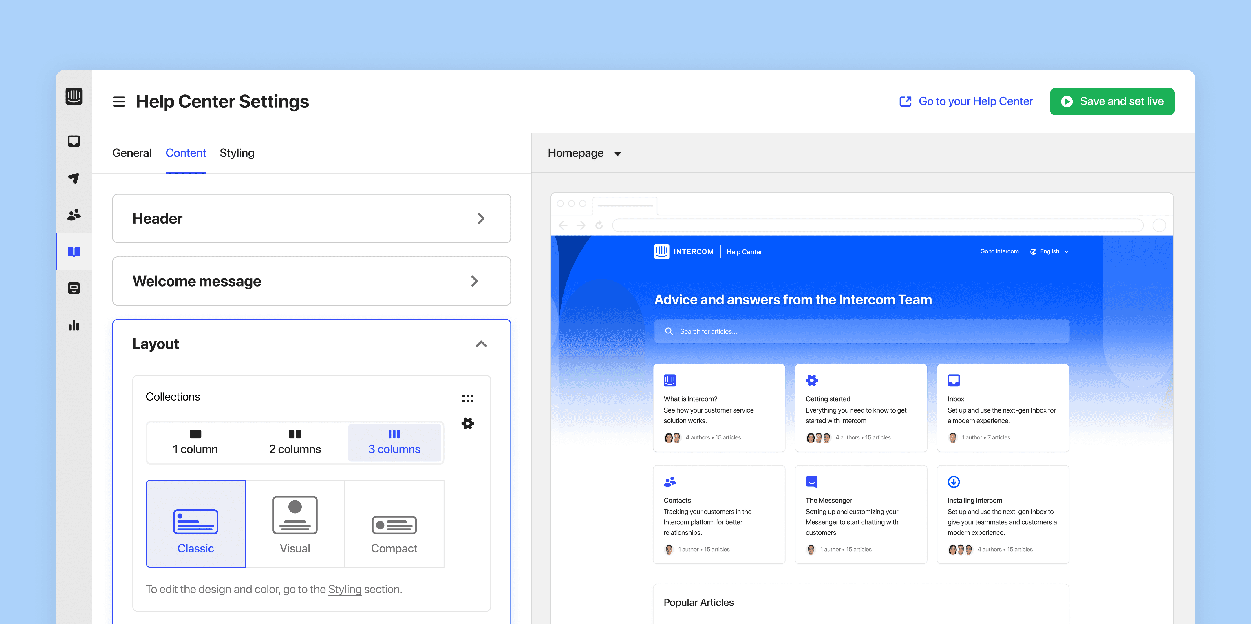


Content
The features in here are all about showing, hiding and organising content. Examples include selecting a card templates, ordering collections and articles, adding/editing copy and adding links to the header and footer.
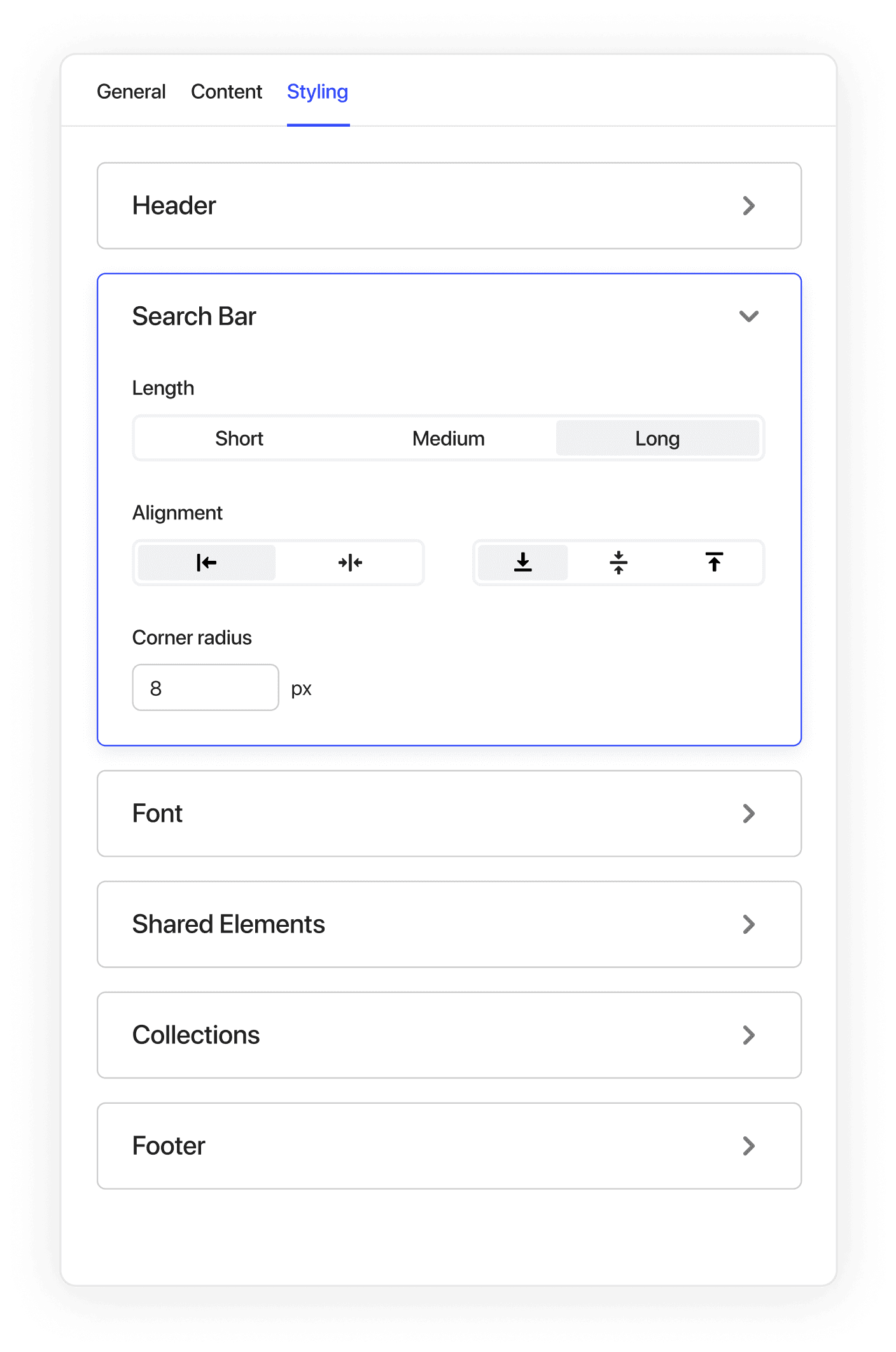
Styling
Features here are for manipulating what’s on screen, such as changing the colour of the header, body and footer, choosing a font and tweaking the card design elements such as the corner radius.
Key Results & Outcomes
11.5% increase in activation year on year from previous year
77% (10/13) of customer panel have switched by end of Q3
Help Center and Articles now equal with leading competitor
Reflections and learnings
UNIQUE DESIGN CHALLENGES
Intercom’s product is used by other businesses to communicate with their end users. This meant looking through the lens of two different user types and designing 2 product Interfaces:
The Intercom Interface that businesses use to set up and a manage their Help Center
The end user facing Help Center experience that is seamlessly branded with our customers branding.
The biggest challenged lied in creating enough varied flexibility in the features we delivered so customers could achieved a Help Centers that is indistinguishable to their own product while also knowing where to draw the line so we could ship value quickly.
PLAN PLAN PLAN
At Intercom we worked in 6 week cycles. Typically designers have design deliverables ready for development ahead of engineers. Ideally design is ready a cycle ahead of engineering however there were times during this project where it was happening a week ahead or on the odd occasion in parallel.
To ensure we met our tight deadlines it was crucial that myself the Product Manager and the Engineering Manager we were flexible in our planning and were able to adapt when needed. We achieved this through a regular cadence of catch ups each week, sharing the workload, reviewing and refining our roadmap as needed, and making trade offs in requirements.
CUSTOMER INTERVIEW PANAL
We hand picked and interviewed 15 participants from the survey. This gave us great insights into context of use, pain points and frustrations, and most desired feature gaps. These customers were also added to panel slack channel where we shared updated designs and requested feedback throughout the project.
SPEED AND EXECUTION
At Intercom we worked tremulously quick. The company set a optimistic goal to be completed in short time frame. There was very little margin for error, mistakes and iteration. It required me and the team to be super focused, communicate quickly and clearly, both synchronously and asynchronously and be cut throat about prioritising and organising our work and time.
MARKETING AND CUSTOMER SERVICE ENABLEMENT
For this project we shipped features on a weekly basis. It was important that we worked closely with marketing and CS to ensure we were all aligned on what was being delivered and how we communicate with customers about new features and any possible changes that could impact satisfaction.
Each time we released a new feature(s) we published a news item (example here), updated our release notes and sent targeted messages to customers who were interested in Help Center updates.